When bad = good in experience design
By Kate DowlerIn a world where negative is the new positive, we explore the concept of bad = good. Specifically, in what situations could something negative, or “bad”, actually be helping to deliver a better user experience or outcome?
In a recent article, I reflected on the different ways of creating emotional highs throughout the user or customer journey. Understandably, when designing user experiences, there is a strong focus on creating touchpoints with strong positive affect, whilst simultaneously minimising any negative moments or points of friction.
But is it as simple as that? Real world experiences are complex, and human emotions even more so. I’ve recently been exploring the concept of bad = good. Specifically, in what situations or contexts could something negative, or “bad”,actually be helping to deliver a better experience or outcome?
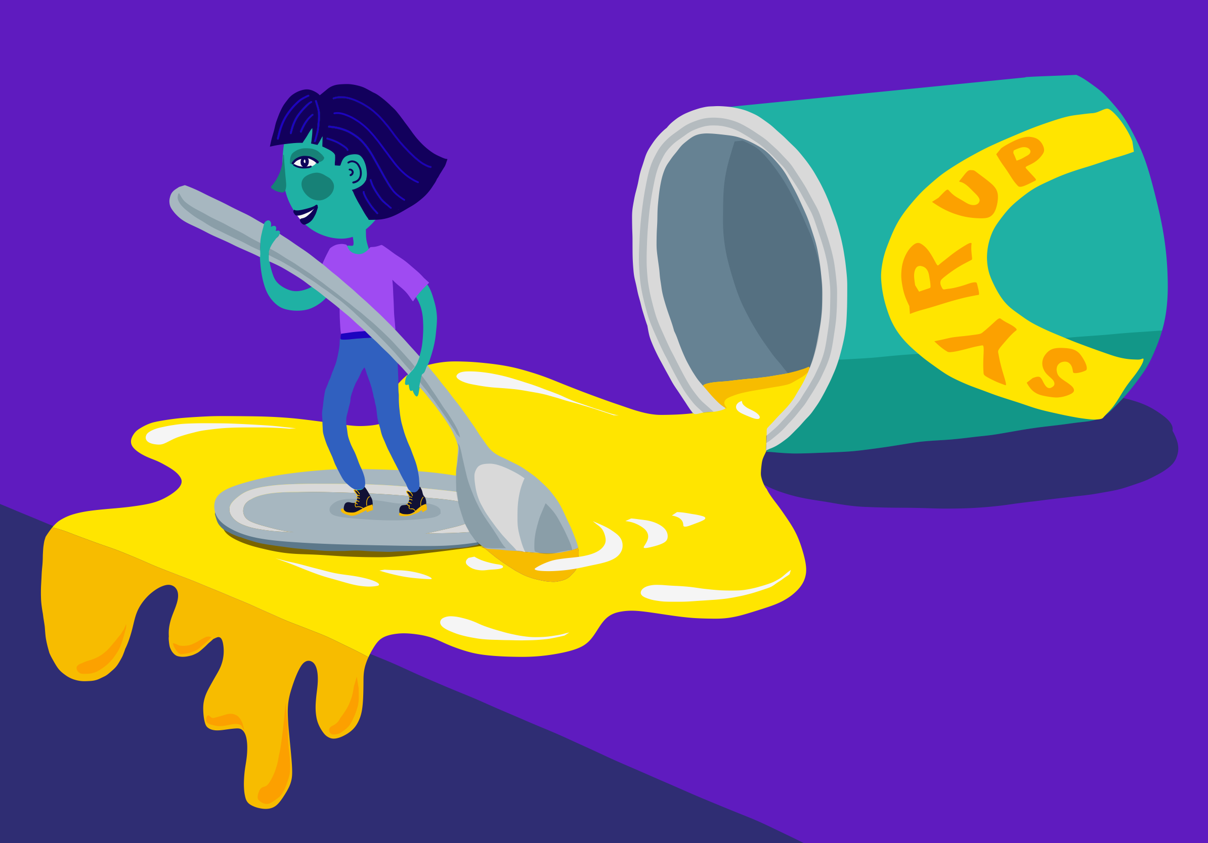
A spoonful of syrup
I started thinking about this concept earlier this year as I watched my 6-year old daughter, Jessica, generously spooning syrup onto her porridge. As usual, it was going everywhere - all over the edges of the tin, onto the table and into her hair. I asked myself why it was that I continued to buy the tin rather than the squeezy bottle.
Most of the marketing commentary about the success of the Lyle tin format focuses on the brand heritage angle. This is definitely part of the attraction, but I realised there was something else going on. The reason I liked the tin was precisely because of the messy experience. The open top with its lid and grooves covered in sticky syrup highlighted the very properties of the syrup which Jessica and I love - its indulgent stickiness and glorious golden colour.
My syrup epiphany led me to search for other examples of when something messy, inconvenient, sad or bad could actually be a good thing when thinking about the overall brand or user experience.
Purposeful friction
The concept of purposeful friction is widely known within the field of UX and experience design. In general, user experiences should be intuitive and seamless, but there are times when friction can serve an important role and lead to better outcomes.
One of the key roles of adding friction into a user experience is to slow down the user, forcing them to switch to System 2(conscious) thinking and evaluate their actions carefully. For example, when looking to prevent errors with severe consequences you might want users to confirm a particular action (like deleting a file).
There’s lots of other interesting applications in this space, including the impact of adding friction to help drive behaviour change, such as increasing the wait for elevators in an office building, therefore encouraging employees to take the healthier option of the stairs instead. Marvily Meirav’s article Make me Think has lots of great examples on this topic.
No pain, no gain
Having to work for something - putting in time and effort, is another example of how a bit of short-term pain can lead to a more positive overall experience and outcome. For example, the ritual (and pain) of wearing in a new pair of Doc Marten’s to get the desired look and feel (there’s a whole user guide dedicated to this process!) Putting in time and effort to create something gives us more ownership of the outcome, and makes us feel more invested in it - a cognitive bias known as the IKEA effect.
Transformative experiences - those that lead to an improvement in physical, mental or emotional wellbeing - also illustrate the power of working for something. Training for a marathon, learning a new skill or taking part in dry January are all experiences which can be challenging and painful at times. However, the satisfaction of achieving personal goals can be highly motivating and rewarding.
Emotional contrast
Some of the most memorable and engaging experiences we have are defined by the complex mix of emotions they evoke. In certain situations, the combination of positive and negative emotions can create a powerful and memorable experience.
In their interesting paper Glad to be sad, Paul Rozin and colleagues explored the evidence for hedonic reversals (the conversion of a negative experience into a positive one). They explored eight different categories of activities which elicit typically negative sensations or emotions, such as sadness (reading sad novels), burning (eating spicy food), fear (thrillrides) and disgust (distasteful jokes). They demonstrated how, in certain situations, co-activation of both negative and positive sensations or emotions can lead to enjoyment, particularly where there is some degree of “distance” from the apparent threat. For example, feeling fear when watching a scary film, but in the knowledge that you, yourself, are not actually in danger. Or feeling the burning pain of spicy food, and enjoying the sensation knowing that it is short-lived.
Another fascinating example is the concept of anticipatory nostalgia - the feeling of wanting to slow down time in the knowledge that something good is coming to an end. For example, that feeling you get when your holiday is drawing to an end. This bittersweet combination of pleasure and sadness has been shown to enhance memorability and overall meaning associated with the experience.
Should we deliberately design in the “bad”?
When it comes to user experiences, the topic of bad = good gives us lots of food for thought (not just of the golden syrup variety!), and demonstrates that it’s not all about creating seamless experiences with solely positive affect.
So, next time you’re designing a user experience, how about running an alternative creative challenge, or “reversebrainstorm” to deliberately design in the ‘bad’ and see what ideas emerge? How might you create purposeful friction with a positive outcome? How might you increase the level of engagement and investment users have with your product by making them work for something? And how might you leverage the power of emotional contrast to create an experience with lasting meaning and memory.

